Customer
Profile
Lead Designer • 2019-2020
UX/UI, Prototyping, User Research, IA, User Flow

The Problem
One of my first roles at Gap Inc. was to lead the design for a newly created product team — Profile. The customer-facing side of Profile comprised a collection of self-service pages on the eCommerce site. Previously, no one team was responsible for these pages, resulting in a outdated, buggy, horrendous experience.

Why can't I access my profile when I'm on my phone?

I don't know where to go, I don't know where I am.

When was this page last updated? 1993? Heh.
Knowing the User
Adopting a user-first strategy, I worked with the Customer Insights team to learn more about our customers. We conducted customer interviews and analyzed the findings alongside data from site analytics (Adobe Analytics and Clicktale) and feedback surveys (Medallia). I used these results to create affinity diagrams and user journeys as artifacts for defining specific redesign objectives and for storytelling with stakeholders.
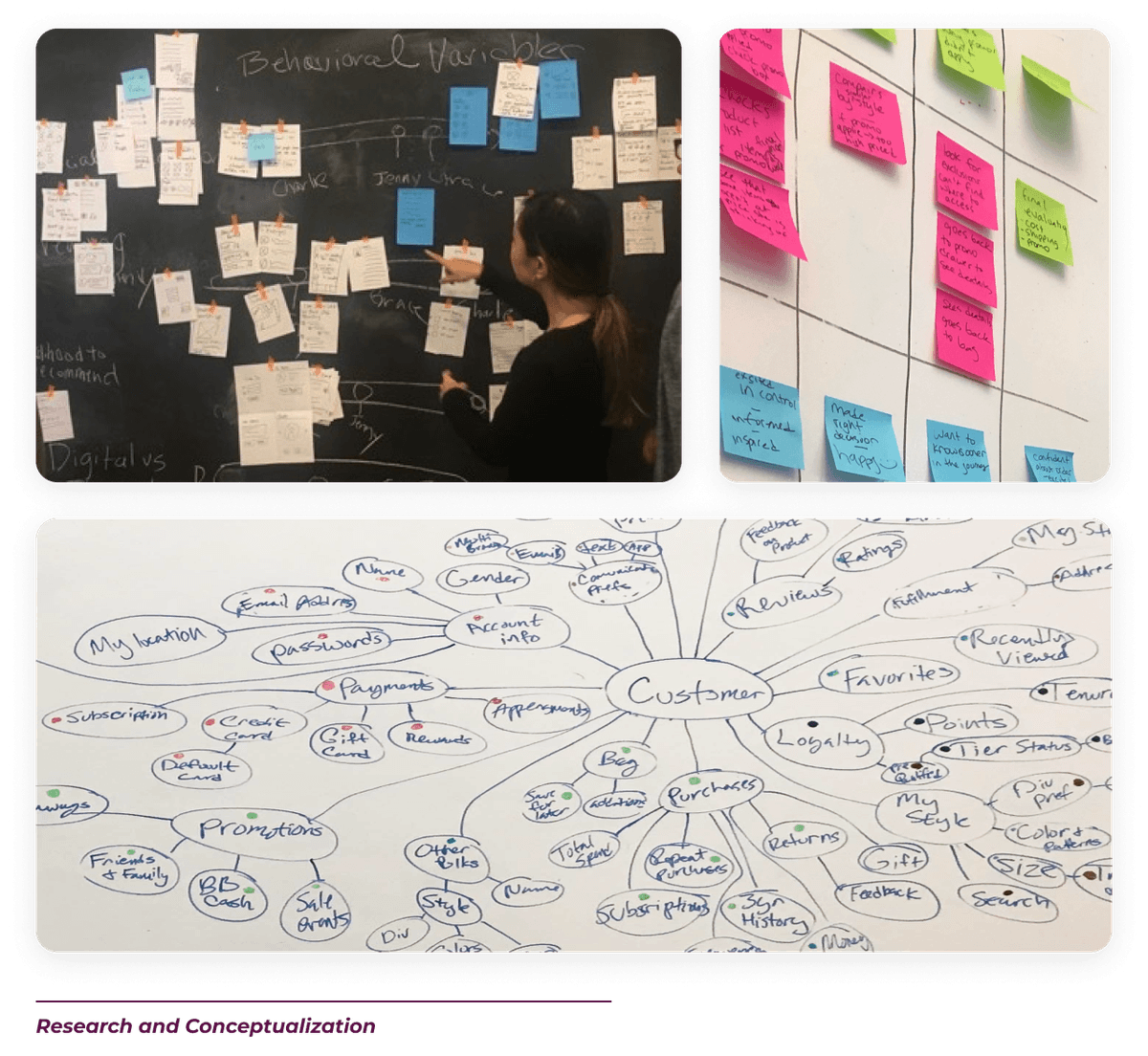
As another source of insight, we conducted card-sorting tests with customers to better understand their mental model of Profile-related content and features. Results from the test were used to update and validate the organization of Profile pages.
The user research gave us a clear sense of what customers want to see most (spoiler alert: order statuses) and when (at multiple points in the journey, through a variety of channels).
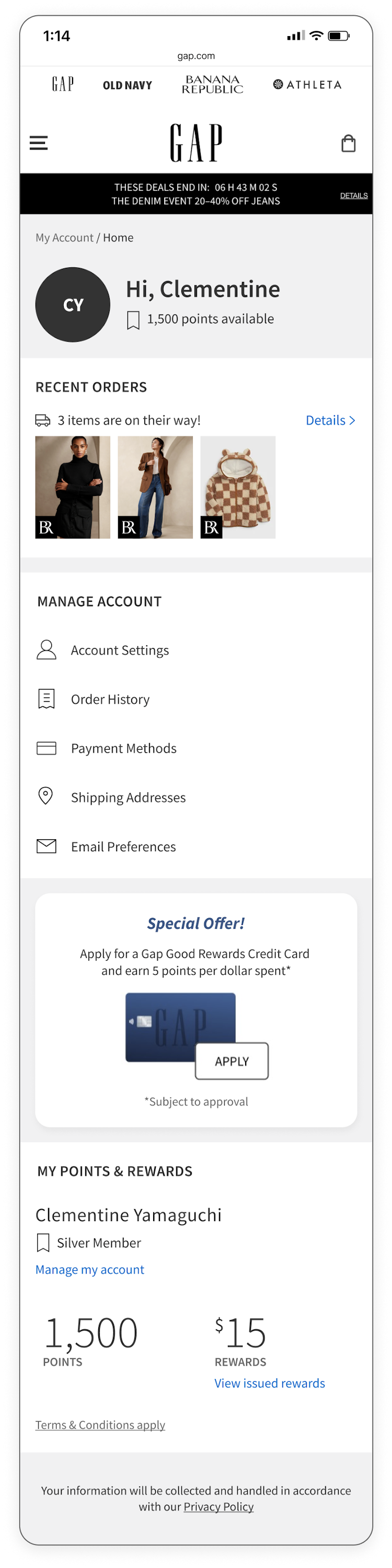
I used the findings as inputs to determining content structure and hierarchy. For example, I designed the Profile homepage as a dashboard with high-level snapshots of key information, like order status and reward points. The product team and I also began chatting with other teams about surfacing some of this information in other pages on the site.
I used the findings as inputs to determining content structure and hierarchy. For example, I designed the Profile homepage as a dashboard with high-level snapshots of key information, like order status and reward points. The product team and I also began chatting with other teams about surfacing some of this information in other pages on the site.
The Rise of a New Design System

Individual Designs < Reusable Components
Since customers overwhelmingly indicated that their order status was among the most important reasons to visit the Profile pages, it seemed to be an easy decision which Profile pages should be redesigned and launched first. Phase 1 was thus: Design the new Order Details and Order History pages.
However as I began taking detailed inventory of the data content, I realized how much Profile-related content was shared across the site. This was true not only among the order-focused pages, but across all of the Profile pages, order emails, and many parts of the Checkout flow.
However as I began taking detailed inventory of the data content, I realized how much Profile-related content was shared across the site. This was true not only among the order-focused pages, but across all of the Profile pages, order emails, and many parts of the Checkout flow.
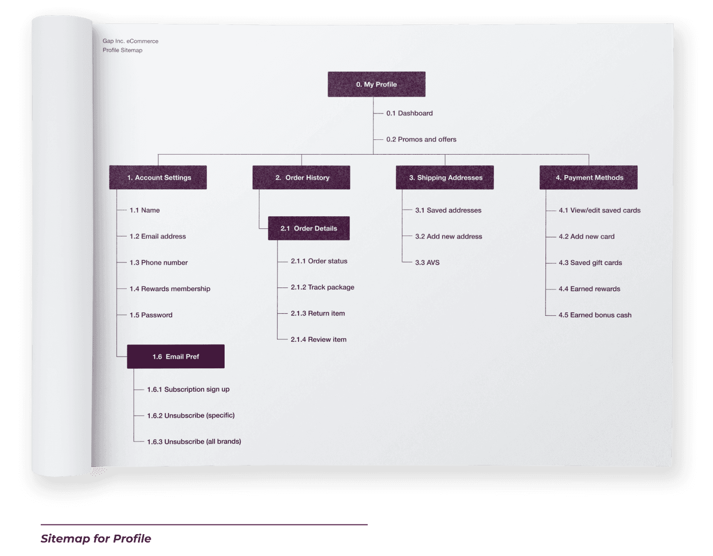
Sign-in

Profile Home

Settings

Addresses

Preferences

Order History

Order Details

I realized that before any individual page could be designed, we first needed a Profile/Account/Checkout/anything-with-Profile-data design system. One that was highly functional yet visually neutral, as these pages (collectively termed the “cross-brand” pages) were shared across the four sister brands.
The case was made to the product team, and later to product leadership, detailing how it would be more efficient in the long run to start the Profile redesign process with the creation of an atomic design system for the cross-brand pages.
The case was made to the product team, and later to product leadership, detailing how it would be more efficient in the long run to start the Profile redesign process with the creation of an atomic design system for the cross-brand pages.
Atomic Design


I started by breaking down the interface into its smallest reusable elements or atoms, such as buttons, input fields, and icons. From there, I combined these atoms into molecules, like form components and content cards, ensuring that every component was accessible, clear, and easy to interact with. These molecules were then assembled into organisms, such as the Saved Address card, Saved Payment card, Add New drawer, and Order History list.


By structuring the design in this modular way, I was able to address both user and business goals. Users benefited from a clear, predictable layout that made updating their information, tracking orders, and managing preferences effortless—reducing frustration and improving engagement. For the business, the consistency of the atomic components streamlined the development process, reducing design and engineering effort while ensuring brand cohesion across the platform. We also hoped that the improved Profile pages would lead to increased self-service actions, reducing the burden on customer support and boosting overall satisfaction.
Final Designs
Using the new design system, I designed the rest of the Profile page and user flows. Throughout the process, I found that I had to refine the design system at several points to better suit the variety of content. Over a course of a year and a half, I'd estimate I designed, went through rounds of reviews, spec'ed, and handed off final designs for over 20 major Profile components, each with many different states and permutations. All of the Profile designs were launched by 2020. A small sample of the final designs are shown below.


