OldNew


The Problem
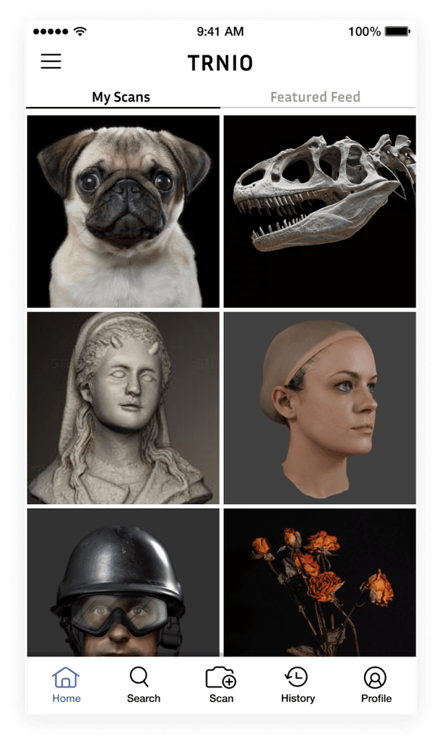
TRNIO is an iOS app offering mobile 3D scanning and sharing. A high number of downloads from the Apple app store indicates strong interest in the product; however, TRNIO realized that new users would create their first scan -- only to never use the app again.
Through interviews and baseline usability testing, we identified two main reasons why people weren't returning to the app:
1. A confusing interface, particularly during the scanning process.
2. The 3D rendering of their scans was patchy, most often due to the user scanning too quickly or not fully scanning their subject.
We thus identified our main design goal: Create a clear, easy-to-use process that helps the user take a high-quality scan.
First, the User
How do you design an interface that promotes organic learnability for a new technology like mobile 3D scanning? (This was in 2017) We started with the users.
During field studies, we observed that as a user moves around the subject to scan, they constantly glance from their phones to the subject and back again. We realized we needed to design for a user that may only be looking at their screen in periphery. We also identified several important factors that affect scan quality, including lighting, movement speed, and comprehensive coverage.
We needed our new design to guide users into maximizing these factors.
Intuitive Scanning
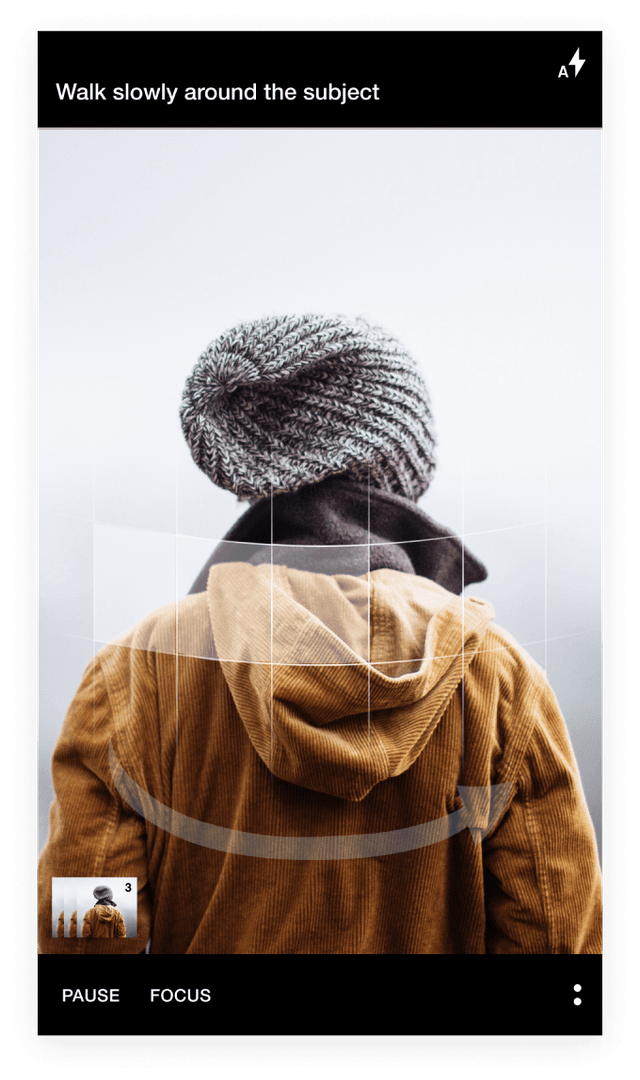
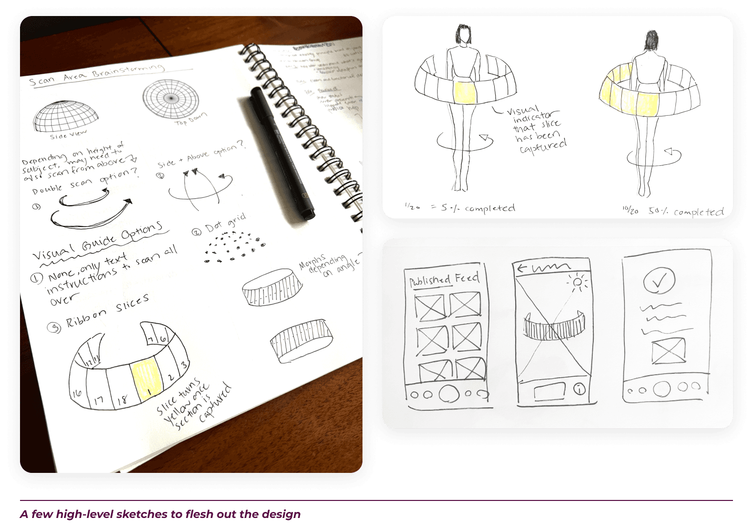
After many ideation and rapid design sessions, we decided on a dynamic graphic overlay in the camera view to provide real-time feedback to the user. We knew that the user’s attention would be divided, so we we designed a minimalistic interface -- with the exception of prominent visual feedback on scan quality as needed.
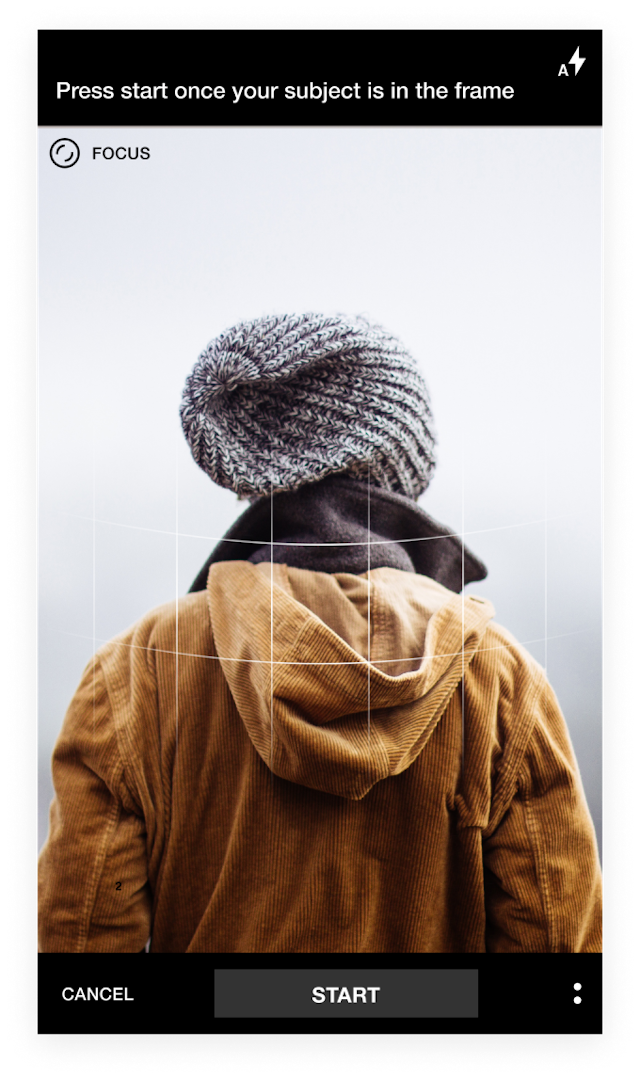
CAMERA VIEW
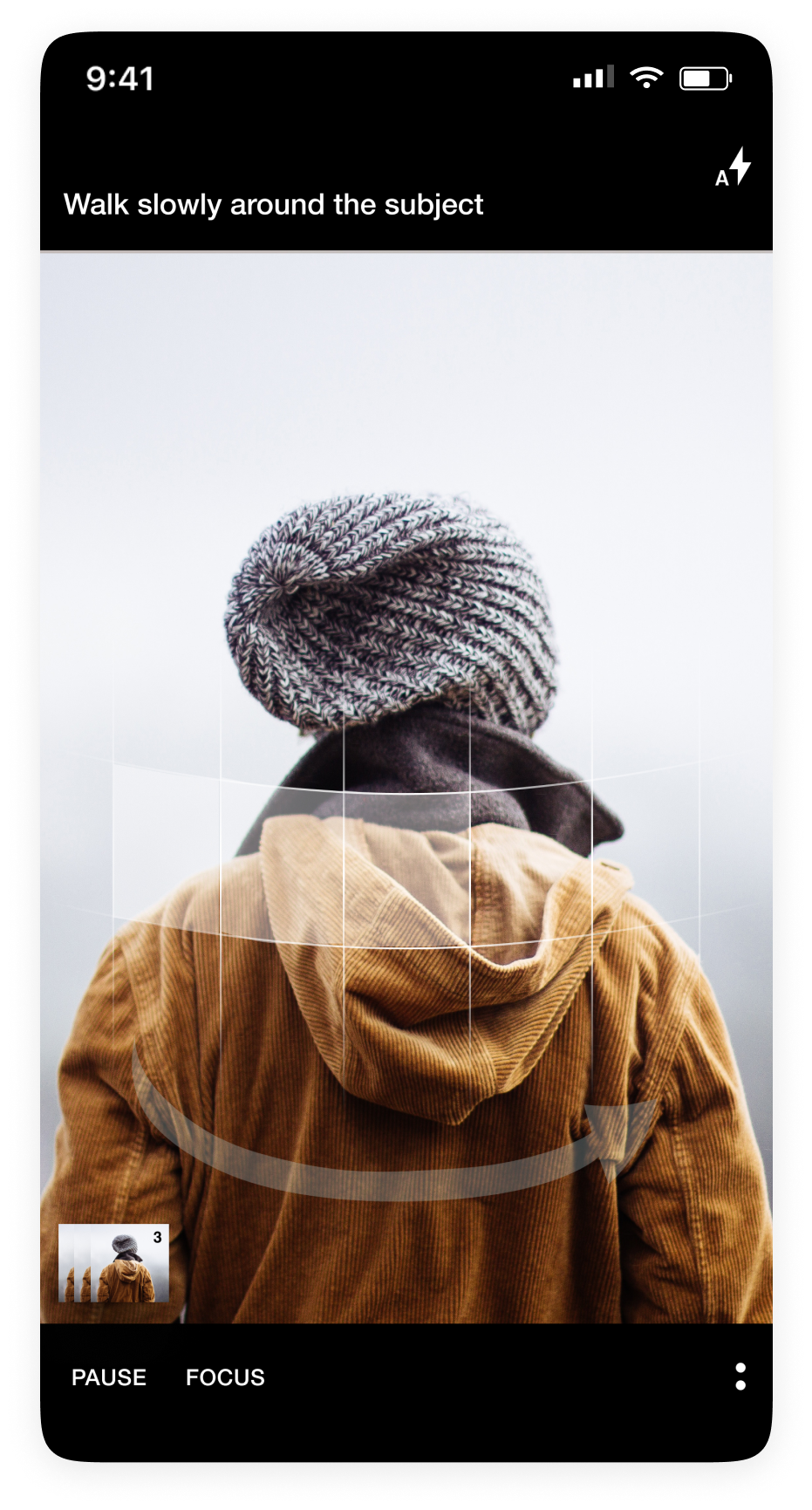
A ribbon overlay appears in the camera view to provide visual guidance for framing the object. It also primes the user on the need to circle the object during the scan process.
The overlay morphs in real-time to provides live feedback on the angle of the camera, as well as which areas need to be scanned.
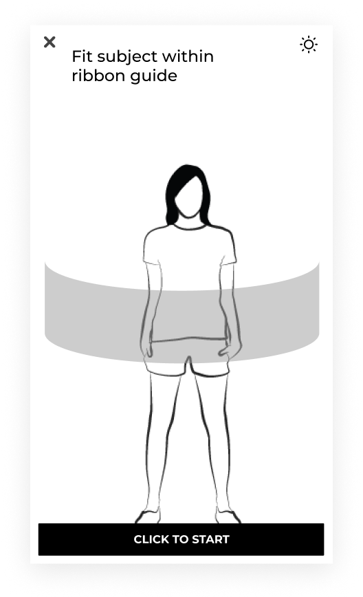
The dynamic ribbon overlay provides the user with live feedback.
SCAN START
Since the user should be primarily focusing on the actual object being scanned rather than staring at their screens, we limited the amount of text instructions and used a larger font size.
The overlay morphs in real-time to provides live feedback on the angle of the camera, as well as which areas need to be scanned.
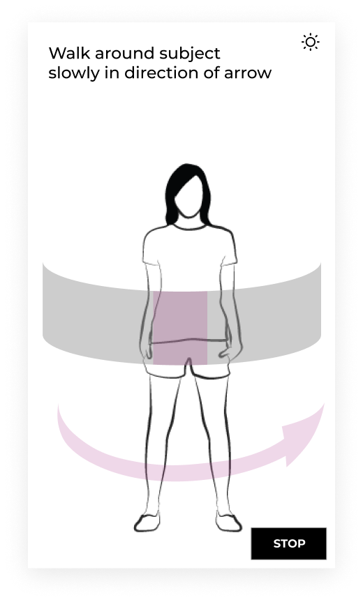
Minimal text instructions allow the user to focus on the scanning subject
WARNING ALERTS
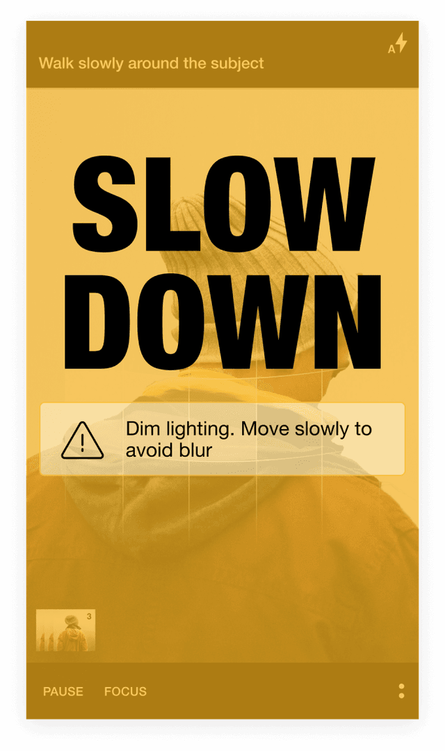
Moving too fast during scanning results in a poor scan quality. We wanted to be able to quickly flag the user’s attention in these situations.
A yellow filter is automatically applied to the entire screen when there’s an important notification. This alerts the user, even if the user is only viewing the screen peripherally.
The yellow filter automatically disappears as soon as user fixes issue.
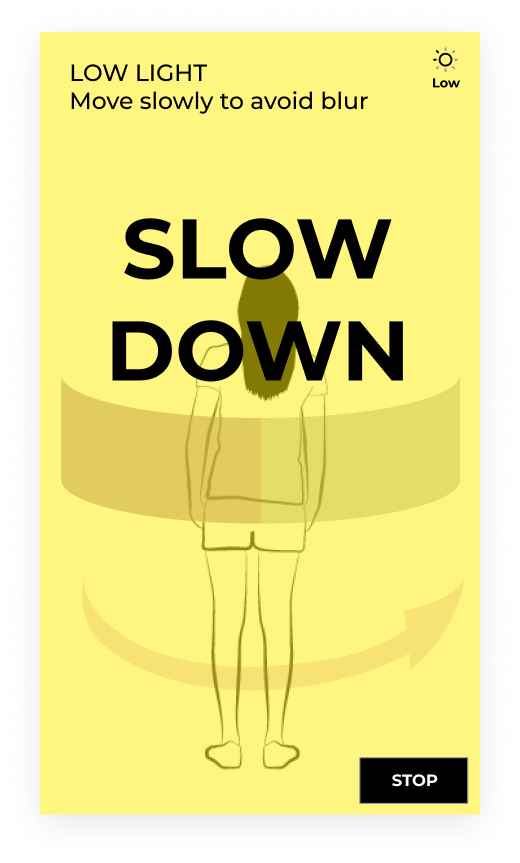
Yellow filter automatically appears over screen during critical messages to flag a user’s attention
OVERHEAD SCANNING
Once the user completes their walk around the object, a vertical arrow appears to inform the user to scan above the object.
In the original app, users didn’t know how to stop the scan process, which required pressing the screen for an extended period. For the redesign, a STOP button is visible throughout the scanning process. Pressing the button gives the user the option to cancel or indicate the scan is completed.
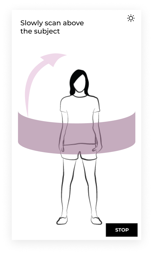
Vertical arrow appears, letting the user know to continue scanning from overhead angles
SCAN COMPLETE
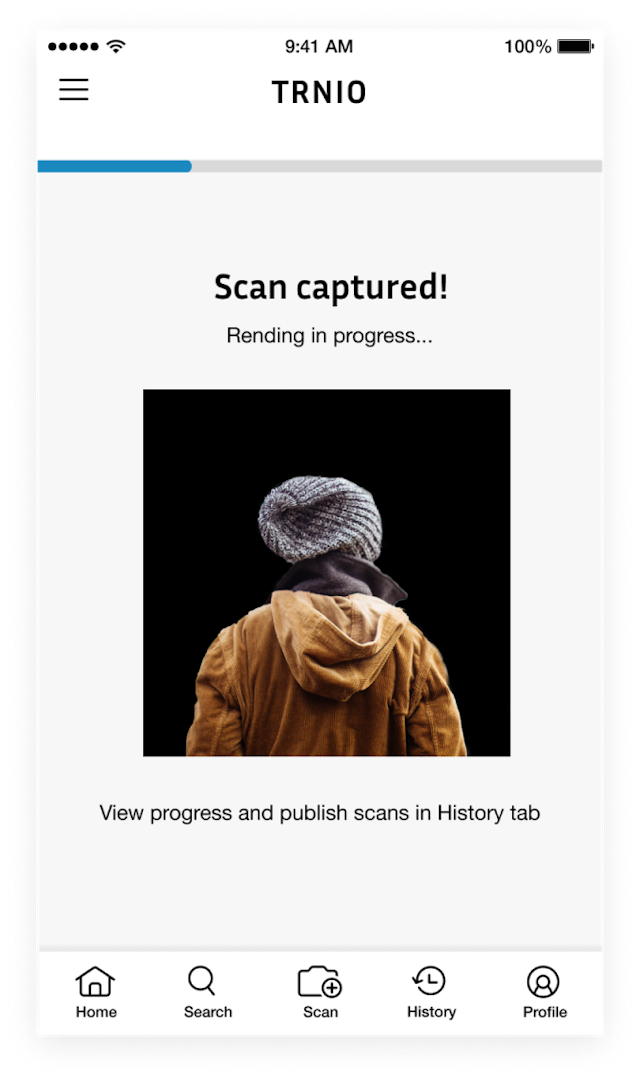
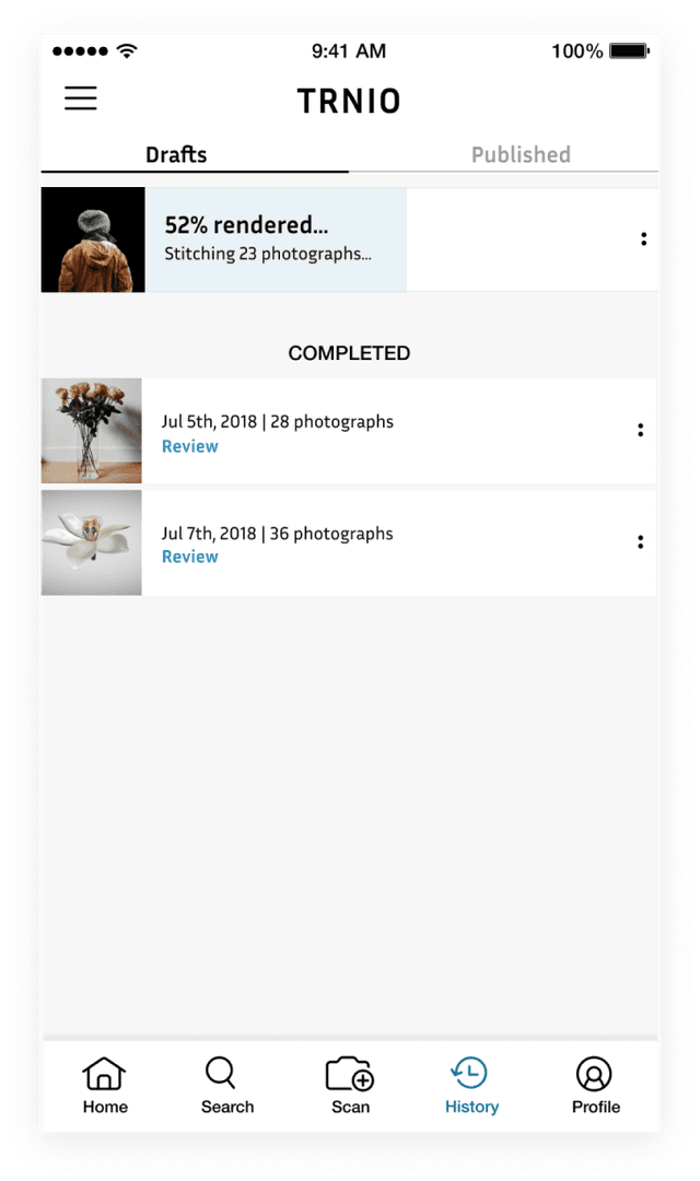
In the original app, once the scan stopped, the camera view screen appears again. Users were confused as to what happened to the scan they just completed, how to view the scan, or if the scan was even saved.
We added a confirmation screen that lets users know what to expect.
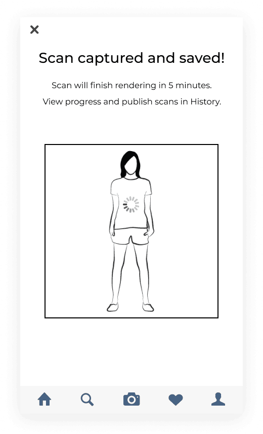
Preview of scan assures user that their work has been saved
Final Mockups
