Optimized
Checkout
Lead Designer • 2022-2023
UX/UI, Prototyping, User Research, IA, Design System
OldNew

The Problem
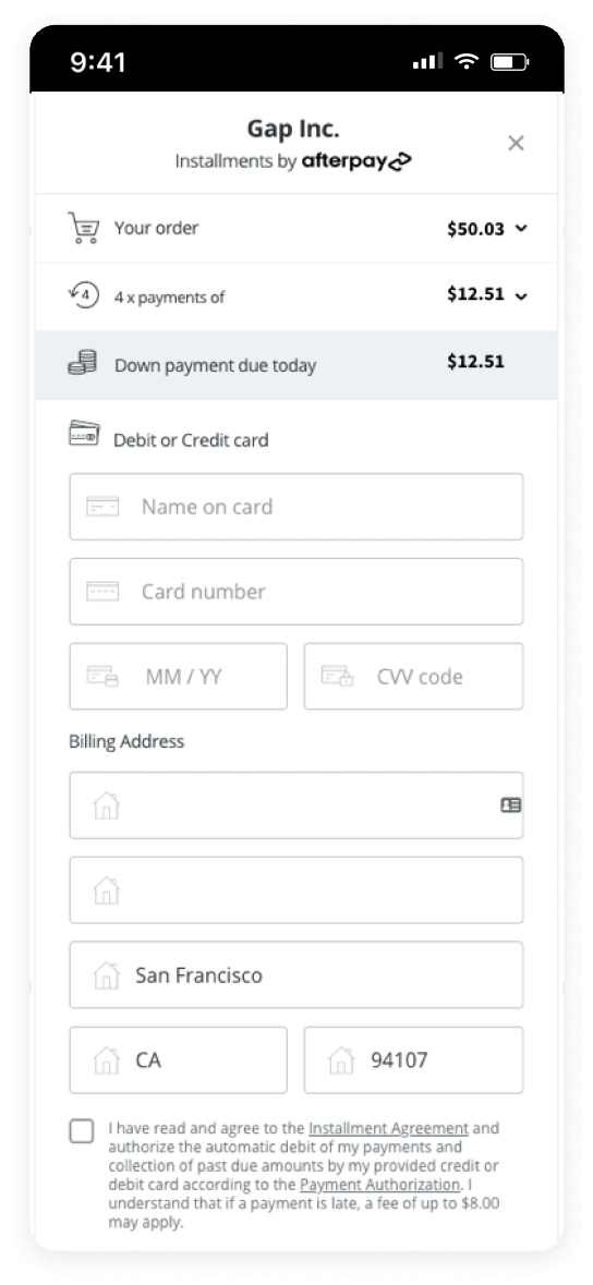
All of Gap Inc's brands -- Gap, Old Navy, Banana Republic, and Athleta share an eCommerce platform that allows customer to add items from the different brands into the same bag for a single checkout experience. The complexities of supporting 4 different brands, along with the piecemeal addition of new checkout features over the last few years (e.g., PayPal, pickup in store, gift message, rewards) resulted in a hodge-podge, scotch-taped, one-size-fits-all experience that frustrated customers.
Looking at Full Story data, the Checkout team noticed that our conversion rate was around 70% on desktop and 60% for mobile users. Feedback through surveys and usability testing revealed that customers disliked having to wade through so much irrelevant information, making it harder for them to finish checking out.

I can't tell which address is selected? Hope I get my order.

This screen has everything I need... but it feels messy. I'm worried I'm going to miss something.

Your site wouldn't let me checkout!!! You lost a customer today!
With this information in hand, I led the initiative to design a user-centered checkout experience to improve customer satisfaction, ease of use, and conversion rates.
Crafting a Framework for Personalization
The biggest opportunity our team identified was the potential to create different experiences for different types of customers. We wanted to anticipate what information -- and at what level of detail -- a customer would want in order to meet their objective.
I started with an exploration of key user scenarios, informed by analytics and user research, in order to define key customer segments. Through rapid prototyping and user testing, I developed overall layouts, user flows, and interaction patterns.
Guiding New Customers
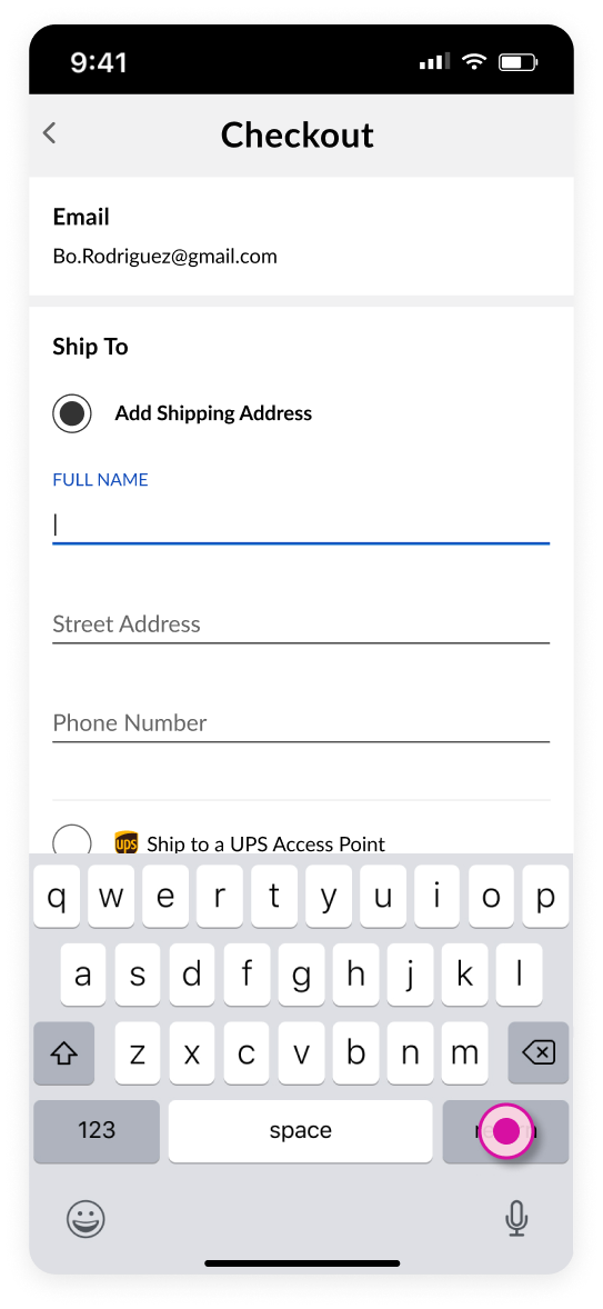
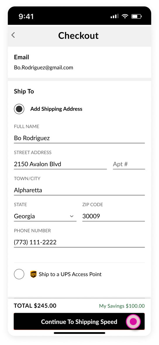
Customers without previously saved data -- whether they're a guest customer or new customer -- are presented with the Stepped View, which guides them through each step of the checkout experience.
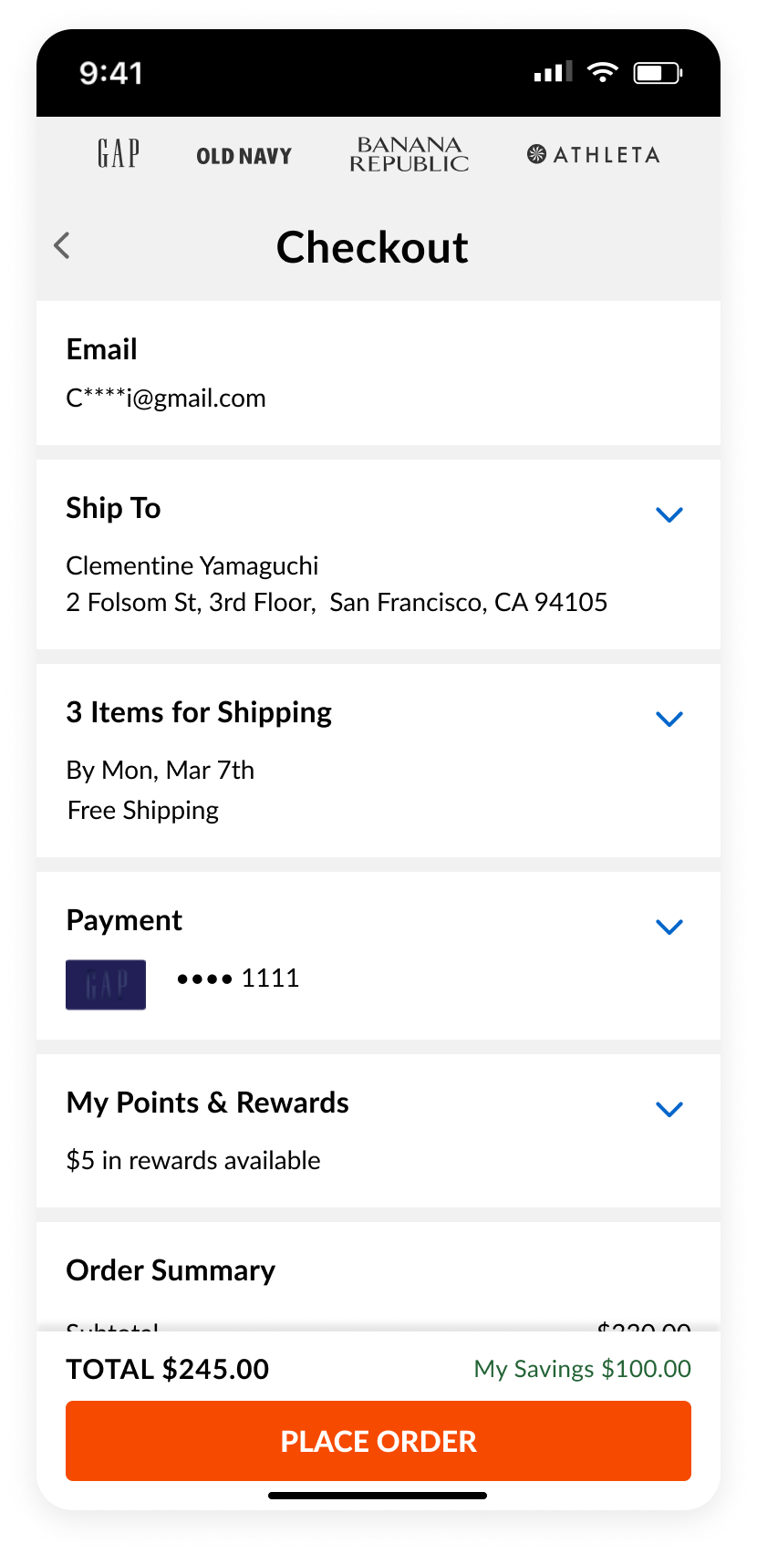
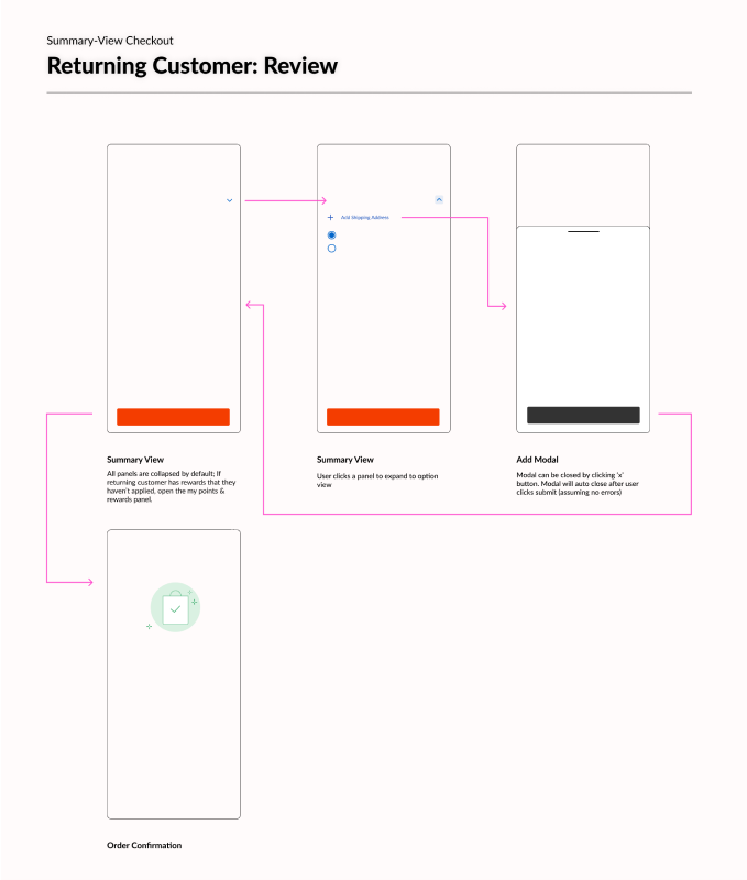
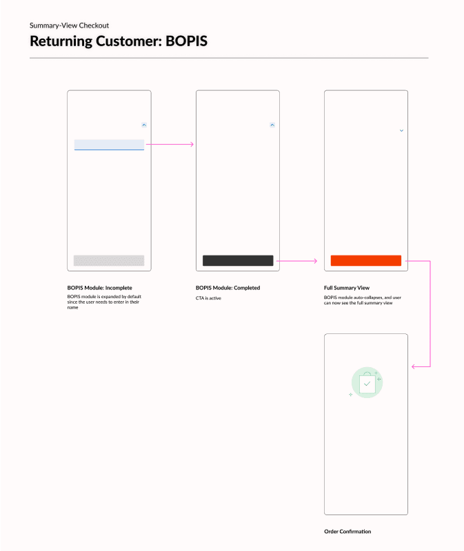
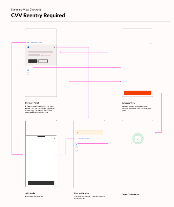
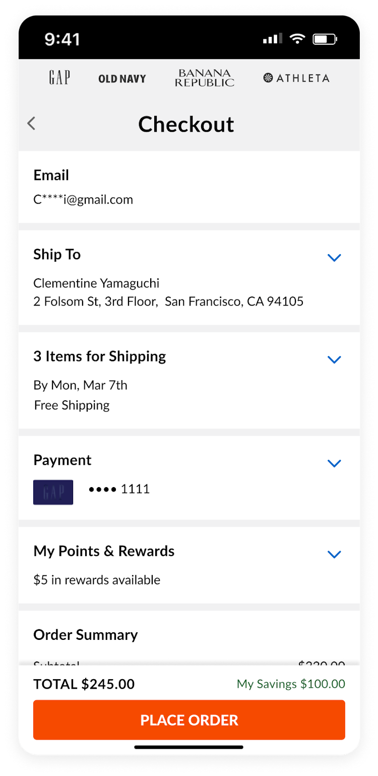
Streamlining for Returning Customers
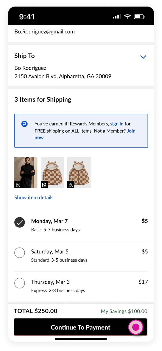
Customers who had previously saved defaults to their account are presented with their full Summary View where they can quickly review and confirm their selections. Changing a selection is as easy as clicking a card and choosing a another saved item or adding a new entry.
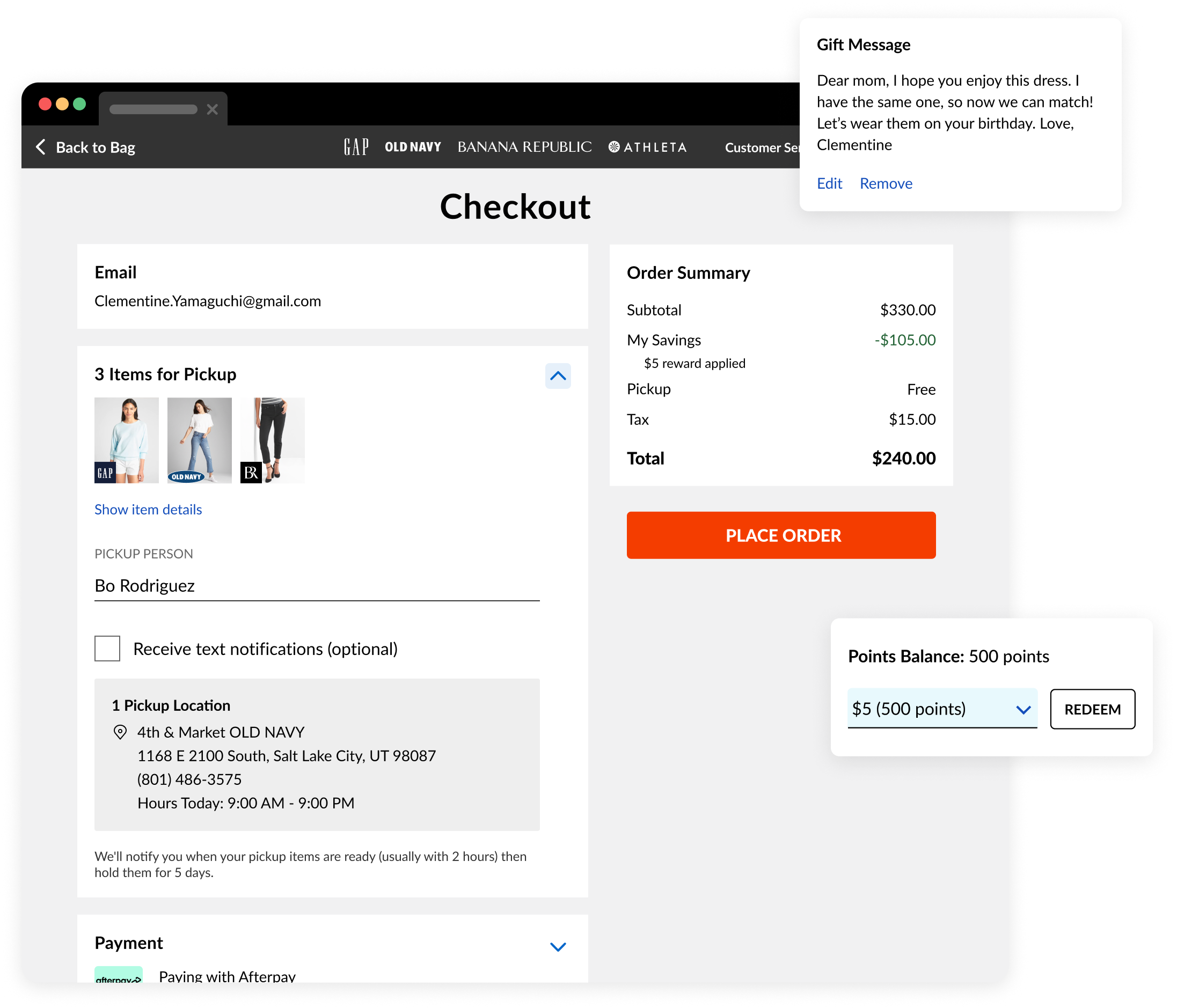
Secondary Personalizations
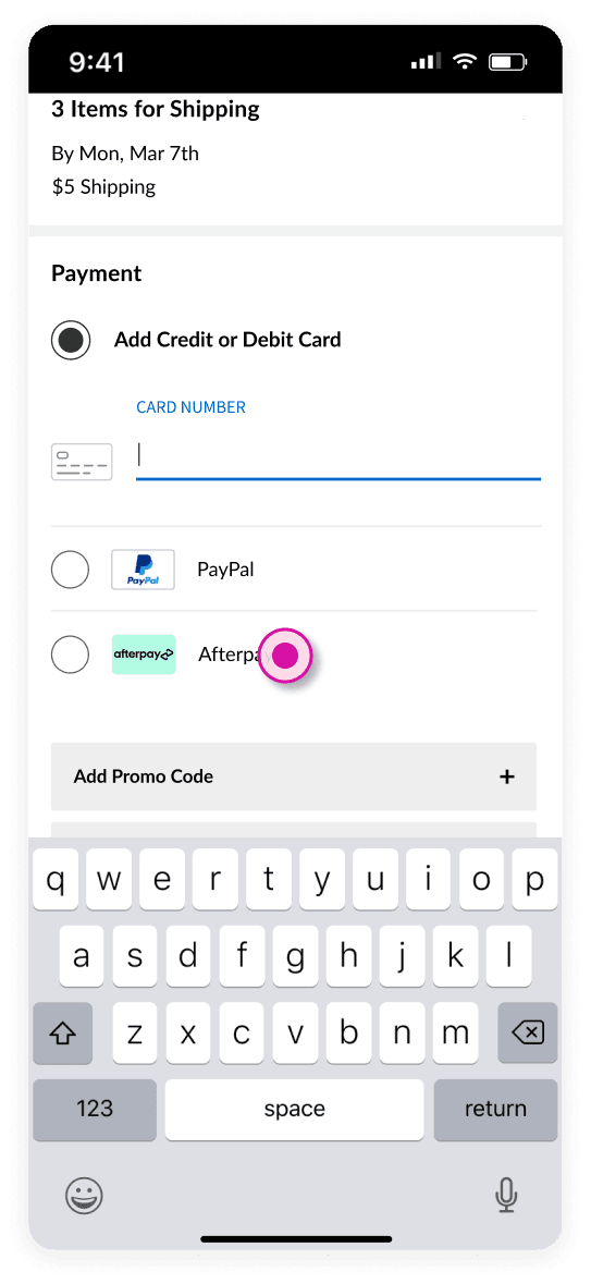
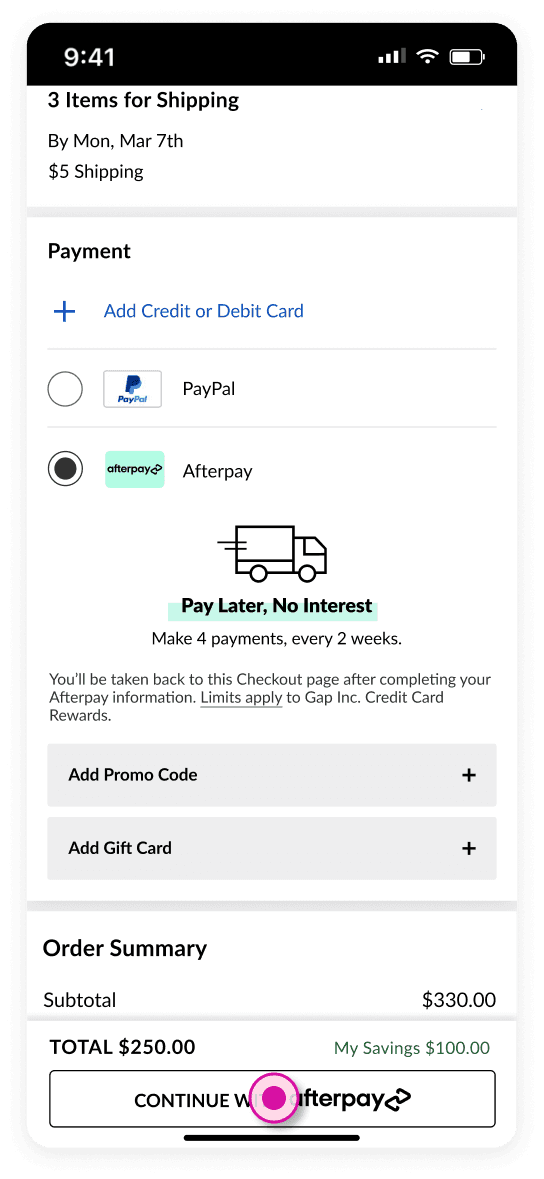
Panels were also personalized depending on the items in a customer's bag, promos, loyalty program status, payment type selected, and many other task-level attributes.
Form + Function
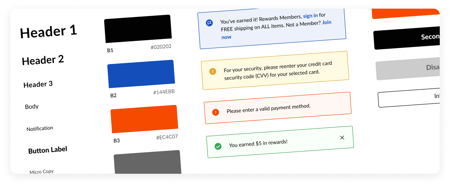
For the redesign, I established a modular design system to enable a more consistent experience, while also improving scalability from a design and development standpoint.
Purposeful, Consistent UI
The design system incorporated both visual and interactive styles. It included typography, visual styles, interaction patterns, and a library of UI components with their states and variants. Each UI component was designed and tested with accessibility as a core value.
I worked with the Checkout product manager and developers on the implementation of the design system over several months. With the intent to deploy this system to other areas of the eCommerce site, I also collaborated with UX designers from relevant product teams to improve the flexibility and applicability of the design system.
Clear Visual Hierarchy
For the overall layout, I used cards (termed “panels” among our team to avoid confusion with credit cards) to group similar tasks together to make it easy for customers to scan and complete required tasks.
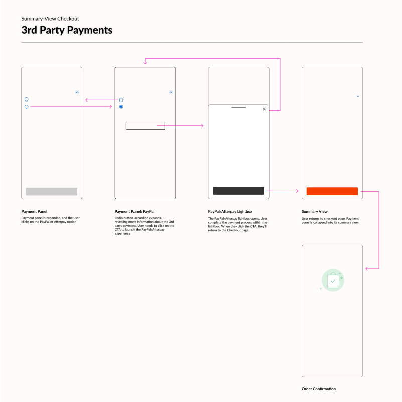
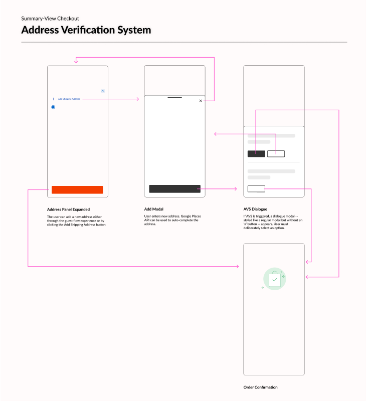
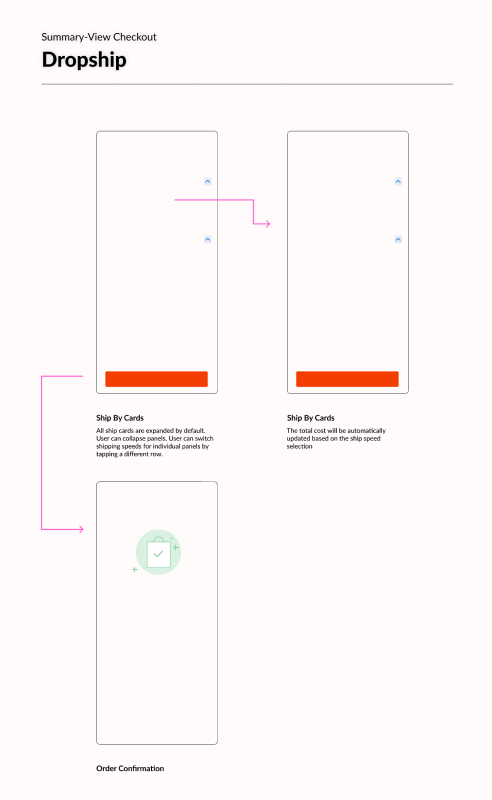
The Summary View of a panel displays the customer's active selection (e.g., default shipping address). The customer can click on the panel to reveal the panel's Expanded Options View, for additional choices and details.
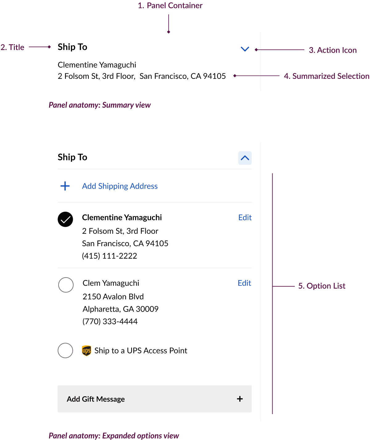
Enabling the panels to have multiple views -- which can be configured as auto-triggered and/or user-triggered -- was the linchpin of the new design's flexibility and scalability. Customers loved how “the right amount of detail is shown at the right time” during user testing. Business leadership was enthusiastic that the ability to auto-expand a panel upon page load would allow them to bring attention to seasonal features they'd like to promote (e.g., holiday sweepstakes, UPS access point)